Lockyz

Branding a security company requires an immediate visual promise of safety and reliability. For Lockyz, we created an identity that feels solid, impenetrable, and premium. The core strategy was to elevate the brand beyond a typical locksmith look into a modern security authority. By combining a deep, authoritative navy with a metallic gold, and creating a cohesive system that spans from physical badges to digital apps, we established Lockyz as a trusted guardian in the access control space.
The Core Identity: Integrated Symbolism
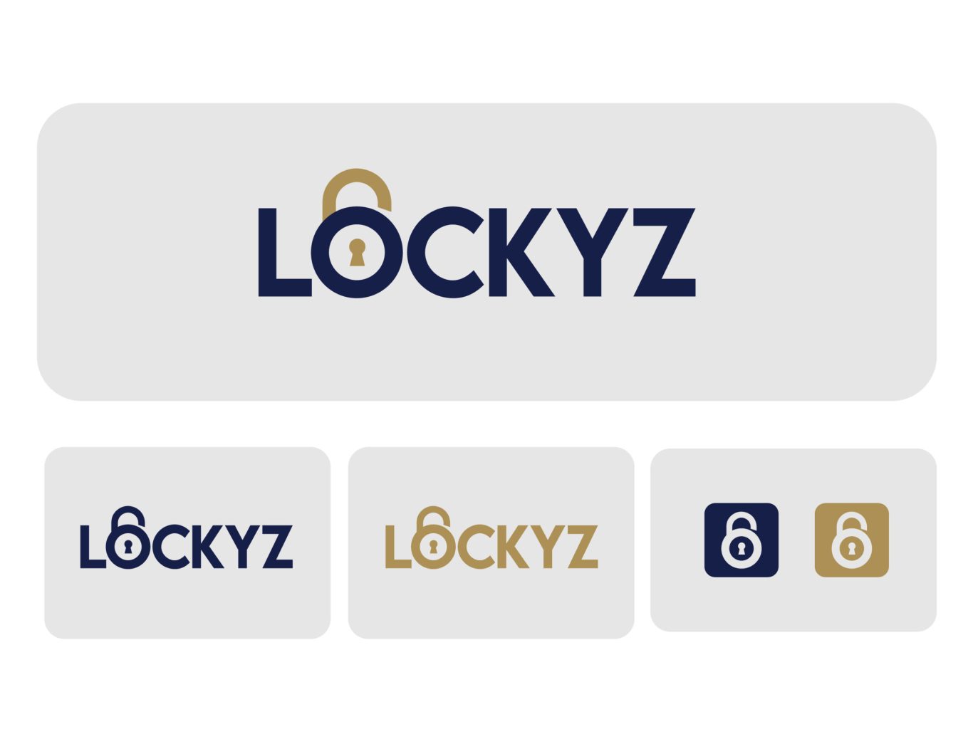
Great branding often implies the solution directly within the name. We engineered the Lockyz logotype to be its own icon by seamlessly integrating a padlock into the letter 'O'. This design choice does double duty: it ensures the brand name is visually distinctive, and it instantly communicates "protection" without needing a separate, disconnected symbol. It’s a clean, efficient mark designed for instant recognition.
lockyz-section1

The Brand Blueprint: A System of Trust

A security brand cannot afford to look messy or inconsistent; precision creates trust. We established a rigorous visual system to ensure the Lockyz brand remains authoritative across all touchpoints. This blueprint defines the high-contrast color relationships and a bold, structural typographic hierarchy. These guidelines empower the client to maintain a professional, cohesive presence, whether on a printed business card or a large-scale storefront.

Digital Adaptability: Engineered for Clarity

In the modern security landscape, a user interacts with their security system digitally as often as physically. We stress-tested the Lockyz identity to ensure flawless legibility on digital interfaces. The logo system is designed for high contrast, offering versatile color combinations that remain sharp and readable on backlit screens, tablets, and mobile devices. This ensures a seamless and professional user experience for digital access control.

More of our projects

Web Applications / SaaS

Get in Touch