Toto HVAC

Branding an HVAC company requires a clear communication of its core service: temperature control. Our design for Toto HVAC is built on this simple, powerful concept. We developed a custom "hot-to-cold" gradient that serves as the primary visual identity. This, combined with a bold, modern logotype and custom flame/snowflake icons, establishes Toto as a high-tech, reliable expert in both heating and cooling.
The Brand in Action: A Versatile Identity
A brand only works if it's cohesive. We designed the Toto identity as a complete system, ensuring it performs flawlessly at every scale. Our design demonstrates how the brand's core elements—the gradient, the logo, and the icons—remain powerful and consistent, whether on large-format event signage, team apparel, or a complex digital interface. This scalability ensures a unified and professional brand experience at every customer touchpoint.
toto-FEATURED1

The Brand Blueprint: A Guide to Consistency

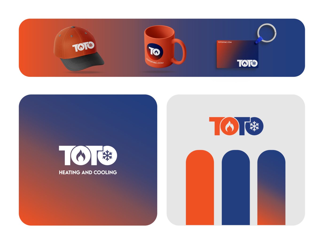
A brand guide is the key to protecting a client's investment. We built a comprehensive blueprint for the Toto team, pairing the bold, modern "Lemon Milk" headline font with the highly-readable "Poppins" family. This guide defines all color palettes, logo lockups, and whitespace rules, empowering the client to apply their new identity with professional precision and consistency across all future materials.

Social Media: A Conversion-Driven Design

This is where the new brand becomes a lead-generation engine. We designed a full suite of social media templates that translate the brand's core identity into high-impact marketing. The bold typography, trust-inspiring color palette, and clear calls-to-action work together to create scannable, professional, and compelling content. This isn't just design; it's a visual system built to stop the scroll and drive conversions.

The Professional Touchpoint

Every real-world interaction is a chance to build trust. We designed all of the brand's professional touchpoints to be clean, premium, and perfectly aligned with the new identity. The use of the deep corporate blue and subtle iconography reinforces the brand's credibility, while the clear typographic hierarchy ensures all contact information is effortless to read. It's a small, powerful tool for reinforcing the brand's quality and professionalism.

More of our projects

Web Applications / SaaS

Get in Touch