Valka Yoga

Branding for the wellness industry must bridge the gap between physical activity and spiritual grounding. For Valka Yoga, we eschewed the typical high-energy athletic aesthetics for a visual language deeply rooted in the earth. The identity centers on a rich, organic palette of warm browns and natural beiges, designed to harmonize seamlessly with sustainable materials like cork and organic cotton. This creates a brand experience that feels tactile, grounding, and inherently peaceful.
The Core Identity: The Asana of Growth
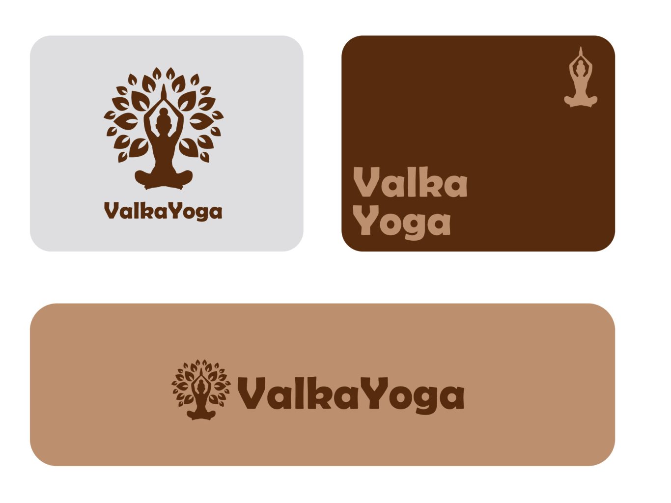
A logo in this space needs to symbolize connection. We crafted the Valka Yoga mark as a seamless fusion of the human form and nature. The icon depicts a figure in a meditative pose that naturally extends into the branches of a tree. This visual metaphor captures the core philosophy of the practice: "root down to rise up." It is a symbol of stability, personal growth, and the harmonious balance between the self and the environment.
vaka-yoga-section1

The Brand Blueprint: An Earth-Tone System

To establish Valka Yoga as a premium, sustainable brand, we developed a rigorous visual system based on natural tones. We selected a deep, soil-rich brown to communicate strength and stability, paired with a warm, sandy beige for approachability. This palette, combined with a soft, rounded sans-serif typeface, creates a visual voice that is authoritative yet gentle, ensuring the brand feels inviting across all touchpoints.

Digital Adaptability: Serenity on Screen

In a modern wellness practice, the user journey often begins on a screen. We stress-tested the Valka Yoga identity to ensure it maintains its organic feel even in a digital environment. The intricate tree icon was optimized to scale down flawlessly for app icons and social media avatars, ensuring that the brand’s message of tranquility remains clear and legible, whether viewed on a studio wall or a smartphone notification.

Material Integration: Tactile Branding

The ultimate test for a lifestyle brand is how it lives in the physical world. We designed the logo usage to integrate naturally with the product line. Whether embroidered onto a meditation cushion or laser-etched into a cork block, the branding acts as a subtle seal of quality rather than a loud advertisement. This respectful application honors the user's practice space, reinforcing the brand's commitment to mindfulness and aesthetic harmony.

More of our projects

Web Applications / SaaS

Get in Touch