Biozer

Branding for the healthcare sector demands an immediate sense of precision, hygiene, and humanity. For Biozer, a modern medical laboratory, we crafted an identity that bridges the gap between scientific accuracy and patient care. Our strategic solution centers on a dynamic “Z” monogram and a calming, professional teal gradient. This visual language establishes Biozer not just as a facility, but as a trusted, forward-thinking partner in diagnostics and wellness.
The Core Identity: A Symbol of Connectivity
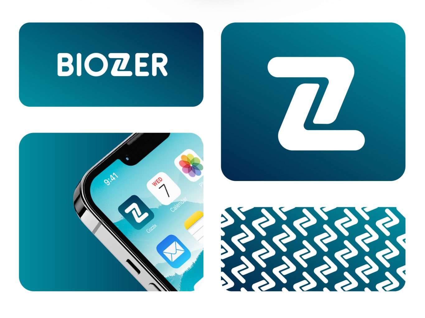
A strong medical brand requires a recognizable mark of quality. We engineered the Biozer "Z" monogram to be more than just a letter; it is a fluid symbol of connectivity and continuous care. This mark serves as the cornerstone of a versatile visual system, capable of standing alone as a powerful app icon or expanding into a seamless pattern. This adaptability ensures the brand remains distinct and recognizable across every physical and digital touchpoint.
biozer-section1

The Brand Blueprint: Reliability Through Consistency

In the medical field, visual consistency equals reliability. We developed a comprehensive design system to ensure the Biozer brand always communicates professional excellence. By defining a clinical yet modern color palette and a clean, legible typographic hierarchy, we provided the client with a robust framework. This blueprint guarantees that every piece of communication—from a lab result to a business card—reinforces the company's reputation for accuracy and trust.

Digital Engagement: The Social Media

Modern healthcare brands must be active educators, not just service providers. We extended the visual identity into a cohesive social media strategy designed to inform and engage the community. The templates utilize the brand’s signature gradient and clear typography to make complex health information accessible and visually appealing. This strategic application turns the brand’s digital presence into a valuable resource, fostering deeper trust with patients.

Brand Integrity: Protecting the Image

To maintain the authority of a medical brand, the visual presentation must be immaculate. We established strict spatial guidelines to protect the logo's integrity in every application. These rules ensure that the Biozer mark always remains distinct, uncluttered, and professional, preserving the clean, sterile aesthetic that is essential for a healthcare provider.

More of our projects

Web Applications / SaaS

Get in Touch