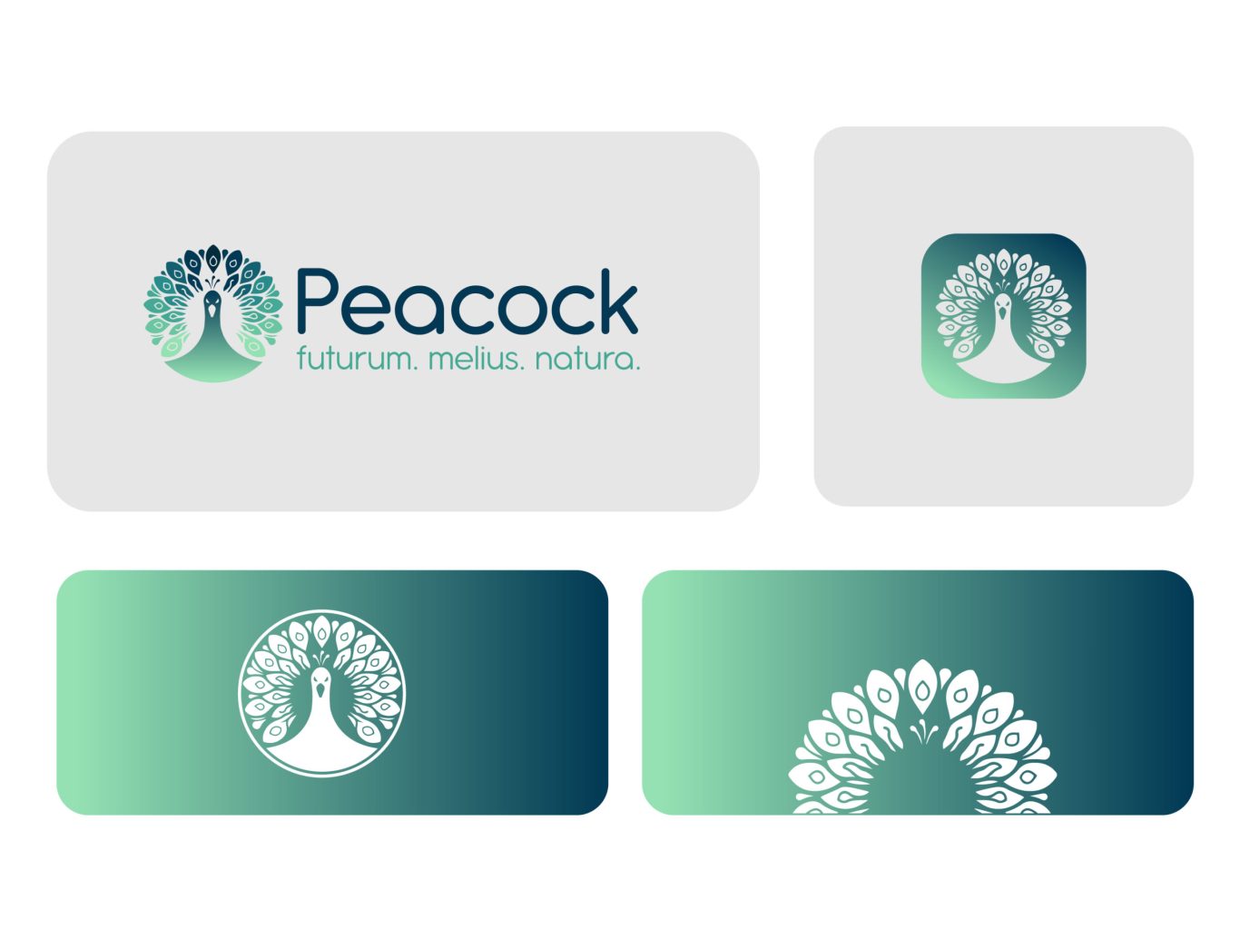
A Palette of Serenity: The Visual System
To evoke a sense of calm authority, we curated a color palette that mirrors the depth of the natural world. We transitioned from a deep, authoritative navy to a refreshing, vibrant seafoam teal. This gradient system is paired with a clean, rounded sans-serif typeface that feels approachable and human. Together, these elements create a visual hierarchy that is professional yet inviting, avoiding the stiffness of traditional corporate branding.