Pool Garden

For property owners in a tropical location like Phuket, maintaining a pool and garden is a constant battle against the elements. The website for JNP Pool & Garden needed to promise the opposite: total peace of mind. We designed a clean, expansive interface that mirrors the clarity of a well-maintained pool. By using high-quality, aspirational imagery and a crisp white-and-blue color palette, we position JNP not as mere cleaners, but as stewards of a luxurious lifestyle.
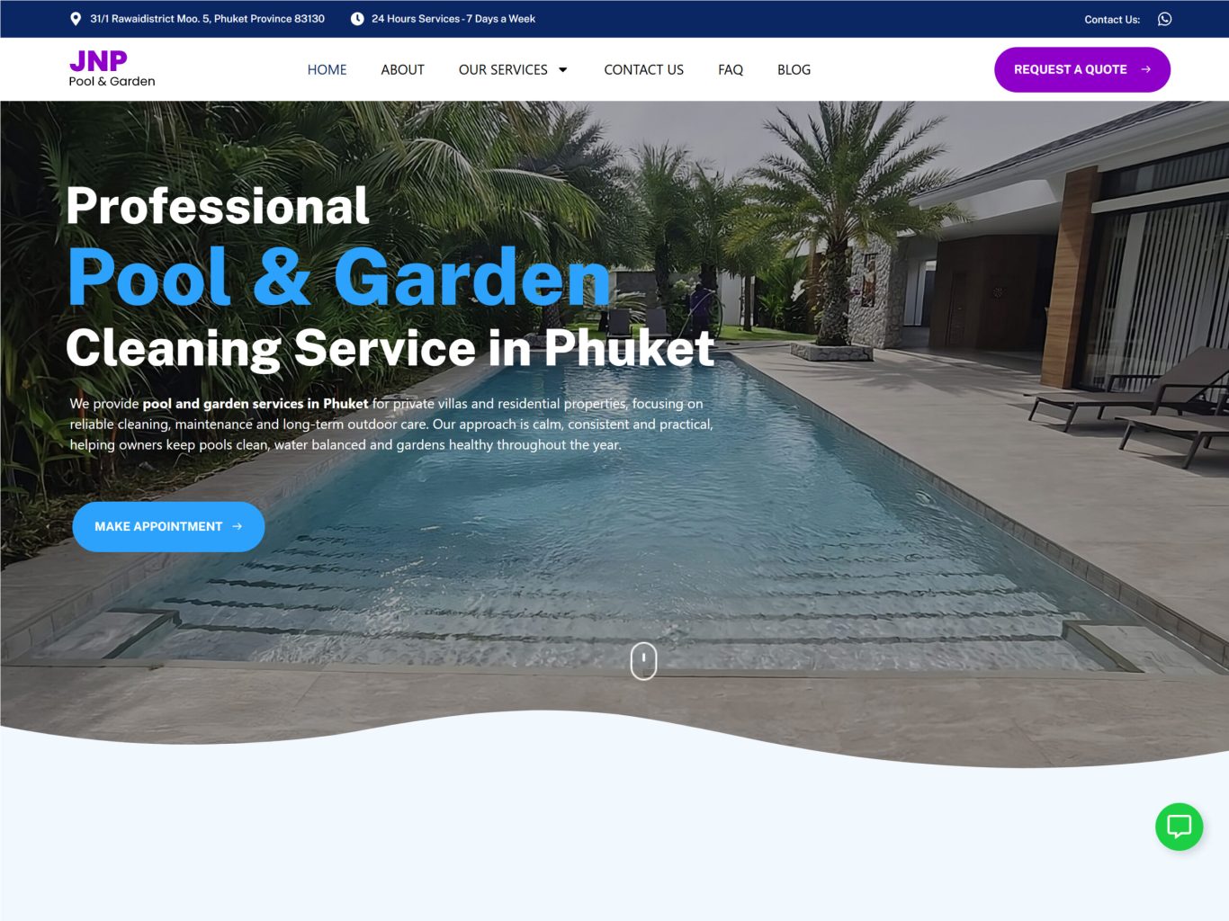
The Hero Section: Immediate Trust
The first screen a user sees determines whether they stay or bounce. We engineered the hero section to establish immediate credibility. The headline is bold and geographically specific—"Cleaning Service in Phuket"—leaving no ambiguity about the service area. We paired this with a high-contrast "Make Appointment" call-to-action button that cuts through the background imagery, offering a clear, frictionless path for urgent service requests right from the start.
JNP-section1

Service Architecture: Clarity in Maintenance

Maintenance services can often feel vague or overwhelming to clients. We solved this by structuring the "Services" section into clear, digestible modules. Using custom line-art icons and a distinct card layout, we categorized complex offerings—from chemical balancing to equipment installation—into simple, understandable products. This visual organization helps the user quickly identify their needs and reinforces the company's professional capability.

Authority Through Education: Content Strategy

Trust in the service industry is built on expertise. We integrated a dynamic "News & Articles" section to position JNP as a thought leader in the Phuket market. By highlighting specific, region-relevant topics like "Gardening in Phuket" or "Pool Maintenance During Rainy Season," we demonstrate that the firm understands the unique local challenges. This content strategy transforms the site from a digital brochure into a valuable resource for villa owners.

Reducing Friction: The FAQ Engine

Potential clients often have specific anxieties about safety, schedules, and chemicals. We addressed these barriers to entry head-on with a clean, accordion-style FAQ section. By placing these answers directly on the homepage, we preemptively resolve doubts about "safety measures" and "repair services," smoothing the path to a sale and reducing the administrative burden on the support team.

Conversion Design: The Soft Handoff

A service website exists to generate leads. We designed the conversion point—a "Request a Quote" modal—to feel lightweight and inviting rather than demanding. By using a friendly, rounded interface and keeping the form fields minimal, we lowered the psychological friction of reaching out. This ensures that the momentum built by the rest of the site translates seamlessly into a booked appointment.

More of our projects

Web Applications / SaaS

Get in Touch