Thrive

In the fitness industry, brands often rely on loud colors to shout for attention. For Thrive, we took the opposite approach: total elimination of noise. We crafted a strictly monochromatic identity that communicates focus, discipline, and high-end performance. This stark black-and-white aesthetic cuts through the clutter, positioning Thrive not just as a gym, but as a premium lifestyle brand that commands authority across wearables, apparel, and digital platforms.
The Kinetic Symbol: Capturing Momentum
A fitness logo must possess energy even when standing still. We designed the Thrive icon as an abstract representation of the human form in motion—capturing the spark of action, whether it’s a sprint, a jump, or a lift. This sharp, geometric mark serves as a badge of progress. When paired with the bold, wide-set typography, it creates a logo lockup that feels substantial and grounded, yet ready to move.
thrive-section1

A Disciplined Visual System

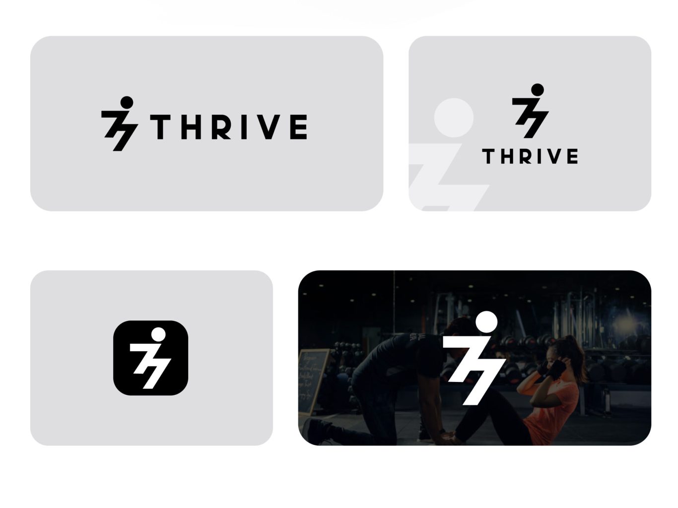
Great branding, like fitness, requires discipline. We established a rigorous visual system that relies entirely on high contrast. By restricting the palette to absolute black and white and selecting a heavy, impactful typeface, we ensured that the brand remains legible and powerful in any environment. This system prevents visual dilution, guaranteeing that the brand looks as sharp on a dark gym wall as it does on a backlit mobile screen.

Digital Immersion: The Dark Mode Experience

The digital experience was designed to mirror the intensity of a workout. We utilized a "dark mode" interface strategy to create a cinematic and immersive user experience. By setting bright white content against deep black backgrounds, we force the user's focus onto the imagery and the training. This design choice elevates the perceived value of the content, making every interaction feel exclusive and professional.

More of our projects

Web Applications / SaaS

Get in Touch