TunePlug

Branding for the music technology sector requires a visual language that feels loud and essential. For TunePlug, we stripped away the superfluous to create an identity of raw power. We established a strictly monochromatic, black-and-white aesthetic that signals authority and high energy. This stark, industrial look is designed to dominate in high-noise environments—from crowded concert visuals to small-screen mobile apps—positioning TunePlug as the ultimate source of audio connection.
The Power Source: Integrated Iconography
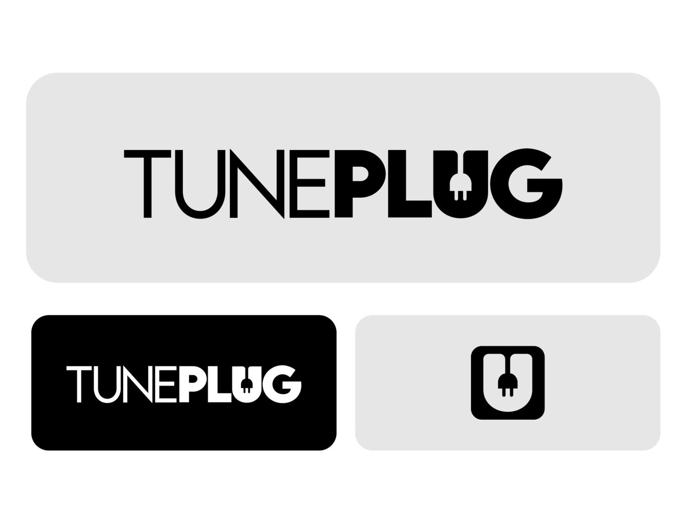
A great logo shouldn't just sit next to the name; it should embody it. We engineered the TunePlug identity around a custom "socket" icon integrated directly into the letter 'U'. This clever use of negative space visually reinforces the brand's core promise - being "plugged in" to the music. It transforms the logotype into a functional symbol of connectivity, ensuring the brand is memorable even without a tagline.
tuneplug-section1

High-Contrast Authority: The Visual System

Music often lives in the dark—in clubs, venues, and backstage. We designed the TunePlug visual system to thrive in these low-light environments. By committing to a high-contrast, pure black-and-white palette and utilizing a heavy, geometric typeface, we ensured maximum legibility and impact. This uncompromising system creates a "dark mode" native feel that is modern, premium, and impossible to ignore.

Visual Rhythm: The Digital Beat

A static brand dies in a dynamic digital world. We extended the identity into a kinetic visual language where the bold typography acts as a rhythmic pattern. By repeating and stacking the logotype, we created a visual "beat" that serves as a dynamic background for digital interfaces. This approach ensures that even the static elements of the app feel active, energetic, and aligned with the pulse of the user's music.

More of our projects

Web Applications / SaaS

Get in Touch